Photography and the Strangeness of Colors
An understanding of colors and how they can transform our photography is a skill we photographers must master. Therefore, getting to grips with the strangeness of color is essential for understanding how to take better photos.
The first strange thing we should know about color is that it doesn’t exist. What we perceive is just our brains interpreting the signals coming from our eyes’ retinas, which have collected photons at different wavelengths. Outside our minds, all that there is are vibrating waves of photons. Red, green, blue, and all the other hues are just our interpretation of those vibrations.
The second strangeness is the confusion about what most of us will have learnt at school. We were told that visible white light comprises the seven colors of the rainbow: red, orange, yellow, green, blue, indigo, and violet. But if you tried to mix those paint colors together, a brown mush would result.
That’s the difference between additive and subtractive light. When we remix those rainbow colors as light, they add together to make white light. However, paints work by absorbing some colors and reflecting others. So, when mixing them together, each pigment absorbs certain wavelengths of light.
When you combine two pigments, the resulting mixture absorbs a broader range of wavelengths than either pigment does alone. The color you see is the combination of wavelengths that are not absorbed. Because each pigment subtracts light, mixing many colours results in less light being reflected, so you get darker, muddier colors.
If you studied human biology, you would have discovered that the cones, the color receptors in your eyes’ retinas, were of three different types. S-cones that detect blue light are considered the most ancient, being the first to evolve around 500-600 million years ago. They cones detect short wavelengths and are found in nearly all vertebrates, including fish and amphibians.
In addition to the S-cones came M-cones, which are green-sensitive. They evolved later, about 300-350 million years ago. Numerous animals have dichromatic (two-color) vision, including antelopes, horses, cows, dogs, cats, rodents, and rabbits. The saying, a red rag to a bull, is false because bulls cannot differentiate red.
Finally, L-cones are red-sensitive and were the last to evolve. In primates, including humans, L-cones evolved relatively recently, only about 30–40 million years ago. L-cones detect longer wavelengths. This development allowed trichromatic vision, which is particularly useful for detecting ripe fruits and young leaves in green foliage.
People who have red-green color blindness lack L-cones. However, they may see more nuanced shades than the rest of us. In the Second World War, it was discovered that color blind people could see the difference between foliage and camouflage, so they were used as spotters in airplanes.
Interestingly, people who have aphakia, sometimes caused by having cataract operations, can see beyond blue into the ultraviolet. Consequently, they see a wider range of colors than most of us. This can lead to them increasing the saturation of photographs to match their perception of the world, although that may seem unrealistic to you, me, or a competition judge.
In our cameras, the sensor collects red, green, and blue light, mimicking our eyes not only in those colors, but in the proportions of each. There are 50% green, 25% red, and 25% blue receptors both in our eyes and on a Bayer pattern of the sensor. (Fujifilm uses a different pattern in its APS-C sensors with around 55.6% green, 22.2% red, and 22.2% blue receptors.)
Each pixel captures only one color due to its red, blue, or green filter. The individual signals from each pixel are sent to the camera’s processor (or raw development program), and the full-color image is reconstructed using a process called demosaicing. However, since the image only comprises various brightnesses of red, green, and blue and not the full spectrum of colors, the reconstruction process interpolates any missing color information by examining neighboring pixels.
That demosaicing process is often underappreciated, but it is an important feature that we should consider when choosing raw development software.
When we look at any object, how it appears to us will depend on the light’s intensity and color. For example, the low-level yellow light of an incandescent light bulb will make an object appear very different from when a harsh halogen bulb illuminates it. However, our brains are pretty good at correcting for those changes, and we still know that a white sheet of paper is white, no matter the lighting.
To illustrate this, if we sit indoors after sunset with the incandescent light bulbs lit, and we hold a piece of paper in front of us, it appears white. But when we look towards our windows, the outside world looks blue. Step outside, and our awareness of that blue disappears. That same sheet of paper still appears white. But looking back towards our home, the light coming from our house appears very yellow.
Years ago, I slept in a green tent. First thing in the morning, I would step outside, and the world would look pink until my eyes became accustomed to the daylight.
Just as our brains adjust to the various light colors, your camera can too. It has a feature called auto white balance. Most cameras are pretty good at measuring the light’s color and adjusting the resulting image accordingly, so white remains white. By default, your camera’s white balance will be set to Auto (AWB). However, you will also be able to override that and manually set it depending on the color of the ambient light.
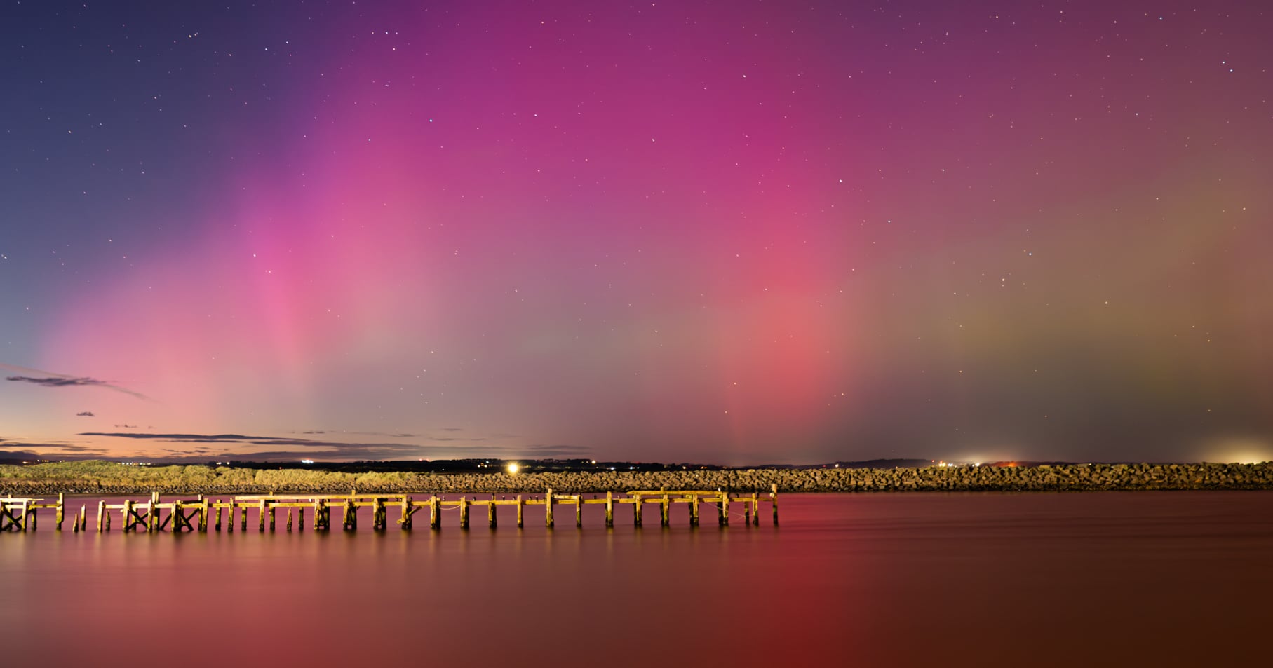
When we see yellows, reds, and oranges, we consider them to be warm colors. Likewise, blues are thought of as being cold. However, in science, reds and yellows are cooler than blues. We know this through a simple experiment most of us have seen. Imagine heating up an iron rod. It starts off glowing red. As it gets hotter, it turns yellow and then blue-white.
When the camera doesn’t get it right, we need to correct the white balance using development or editing programs. So, if the ambient light is too blue, we adjust it by increasing the yellowness of the image because it needs to be psychologically warmed up (scientifically cooled down).
However, sometimes photographers want to override the white balance. Many landscape photographers like their photos to have a slightly yellowish glow. Therefore, they will adjust the white balance to make the picture appear (psychologically) warmer.
It’s essential to understand the difference between hue, saturation, and luminance in colors.
Hue is what we commonly think of as color itself, and we know the differences between red, green, yellow, and blue, etc.
We also know that each of those can change in intensity or saturation. Highly saturated colors are bold, and their vividness gives impact and excitement. Meanwhile, pastel shades with a low saturation provide feelings of calmness in a photo.
Meanwhile, the luminance of the colors is how dark or bright they are.
In the development and editing software, we can change the hue, saturation, and luminance of all colors at once or one color at a time. One common mistake a novice photographer often makes is being too heavy-handed with the saturation slider in software. However, remember what I said earlier about aphakia. It’s possible that what some might consider an oversaturated image could be a close interpretation of how they see the world.
You may see a vibrance slider sitting alongside the saturation slider. It works differently in that it only adjusts the saturation of the more muted colors.
Experienced photographers use color to convey emotion and meaning. However, those meanings aren’t fixed. They shift across both time periods and cultures.
Consider white. In many Western societies, it symbolizes purity, which is why brides traditionally wear white. But this custom only dates to Queen Victoria, who wore white to her wedding to support a struggling lace industry. It was not originally intended to represent innocence. Before that, brides wore dresses of all colors, often simply choosing their “Sunday best” outfit, which was frequently black among working-class women, as black dyes were cheap.
In contrast, white in China is associated with mourning and is worn at funerals. Red and gold, symbolizing happiness and prosperity, are the traditional wedding colors.
Red in the U.S. flag stands for valor, in Kenya it represents sacrifice, and in the Aboriginal flag of Australia it signifies the earth.
Politically, red and blue have the opposite associations adopted in the U.S. and the UK. In Britain, blue is the color of the right-wing Conservatives and populist radical right Reform Party. In the U.S, however, red represents the conservative Republican Party. However, red also appears in flags linked to communism, socialism, and even far-right movements such as the Nazis.
Even within one culture, a single color can carry conflicting meanings. In the West, red can evoke both love and aggression.
This is just touching the surface of what color is, and the fascinating strangeness of it. There is plenty more that we will cover in more depth in future articles.