Our Verdict on Annie Leibovitz's Anne Hathaway Photos in Vogue
Annie Leibovitz has been catching heat this week for her Anne Hathaway photo shoot for Vogue magazine. But what do the PetaPixel writers think?
I don’t mind Annie’s color balance choices and framing, for the most part. I think the split-toned color in the museum, the really green image in the park, or even the green tint to the cover photo are all stylistic choices that are perfectly fine.
Where I start to scratch my head is with the photo titled “Set in Stone.” It looks like Hathaway just partied all night, and this photo was taken right as she was exiting the club, when she was sitting on the curb, nursing a headache, and the Sun is just a few minutes from rising. If there is some kind of artistic statement being made here beyond “she’s tired,” it isn’t being well conveyed.
Jeremy Gray brought up a good point in our online discussion about these photos: if anyone else submitted these for publication other than Annie, would they have been published? Maybe some of them, but not “Set in Stone.”
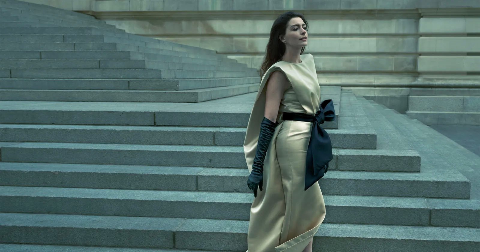
If we’re going to nitpick, “Taking a Bow” is also a confusing frame. I don’t love that Hathaway’s toes are cut off for one, but the photo is overall unsettling to look at due to the parallel lines that are being drawn diagonally from top to bottom by both her and the bridge. Also, why is there someone just like camping in the background? Is there another artistic statement being made here? Is that just the crew that didn’t realize they were in the shot? I don’t get it.
I think Annie is an absolute master of light shaping, but I also think that on occasion, and every 10 years or so, she gets bored or distracted. The last time I recall this happening with a high-profile shoot was with the big Disney-themed shoot back in 2012. Some of those compositions look totally phoned in, with lighting that makes little to no sense. But I think her portraits of Ronaldo and Messi are beautiful, as is her IKEA At Home series. She’s obviously capable, and she’s gotten to where she is for a reason. But imagine being a band that only ever wrote one hit and performing it for 20 years on tour. You’re eventually going to get bored and want to try something new. Unfortunately, sometimes that new thing is just not as good as what made you famous.
Annie Leibovitz’s incredible reputation has been well-earned. For more than 50 years, she has captured countless iconic portraits of legendary figures and successfully pushed boundaries few others could. Her legacy will be one of remarkable achievement and lasting influence.
So Leibovitz has earned the right to gamble with ideas, but some risks do not pay off. While I don’t think the much-maligned Vogue shoot with Anne Hathaway is a complete and utter failure, it is likewise not good.
There are some shots in the series I like. The Vogue cover photo is nice, and I don’t think the green tones undercut Hathaway’s radiance. I like the subdued saturation and the natural look to Hathaway, who can clearly command a space with equal parts power and grace.
I even really like the photo, “Women of the Hour,” even though the heavy blue toning is a bit jarring. I don’t like how many lines are angled or the very tight cropping on an otherwise interesting background. I find the painting on the distant back wall behind Hathaway distracting, too. All that said, I think it’s a fascinating portrait with a compelling scene. Is it perfect? No, but I like it all the same.
There’s one more photo in the series I quite like: “Green Day.” It’s airy, verdant, and dynamic.
That’s where my enjoyment of this new series ends, though. And, frankly, even the images I like could have been so much more compelling and engaging had a few decisions been made differently.
“Free Movement” is flat and jaundiced, robbing Hathaway of vitality. “Set In Stone” is puzzling in nearly every way, and “Taking a Bow” is somehow dreary and cold, despite its overwhelmingly warm color palette.
Leibovitz is at her best when making dramatic, cinematic, theatrical portraits. There are scant few hints of her unique talent here in the new Vogue shoot, and the series falls flat as a result. Even masters can miss the mark.
I don’t think there’s anything particularly bad about them. I just think we have a really high standard for Annie Leibovitz.
And if you look at the pictures in Vogue, the ones Leibovitz did are very in keeping with the style of that magazine. These are just very Vogue pictures — maybe that was the brief.
I think people like to hate. She’s the most famous and most talked-about photographer in the world; everything she does gets a lot of heat.
Leibovitz’s photo shoot with Anne Hathaway spanned at least four different locations that included nine looks. As a photographer, thinking about getting a good image from every one of those locations, with different lighting and ambience, sends chills down my spine.
I really don’t mind the color on each image; I like how each frame tells a different story through cinematic lighting. Leibovitz is definitely breaking the rules when she crops through feet and hands, something that most photographers wouldn’t countenance. But maybe her willingness to push boundaries is why she’s a visionary, and why she keeps getting hired.
Image credits: Vogue / Annie Leibovitz